phase 3: Late September - Late October
schematic design/ sections/ journey
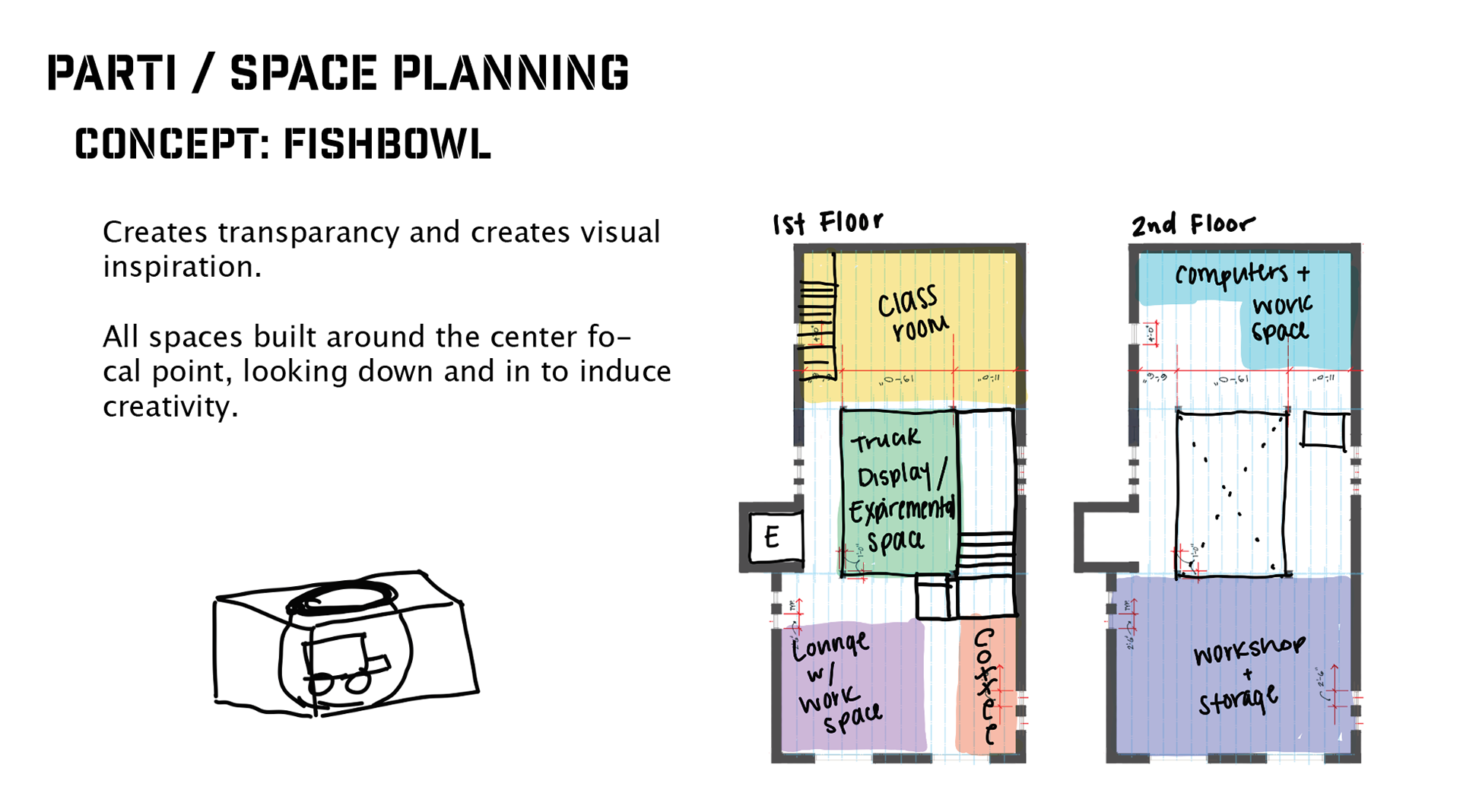
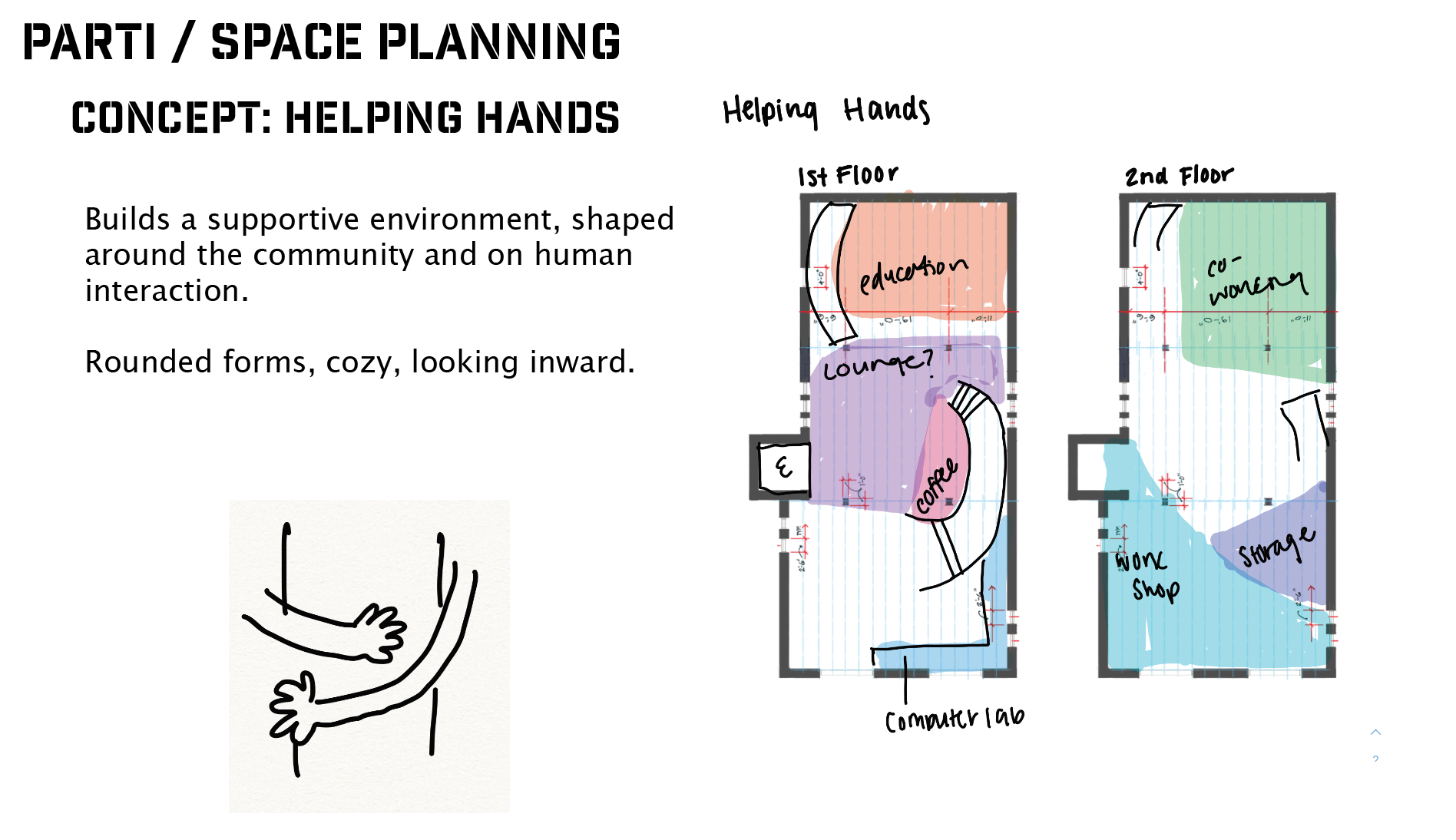
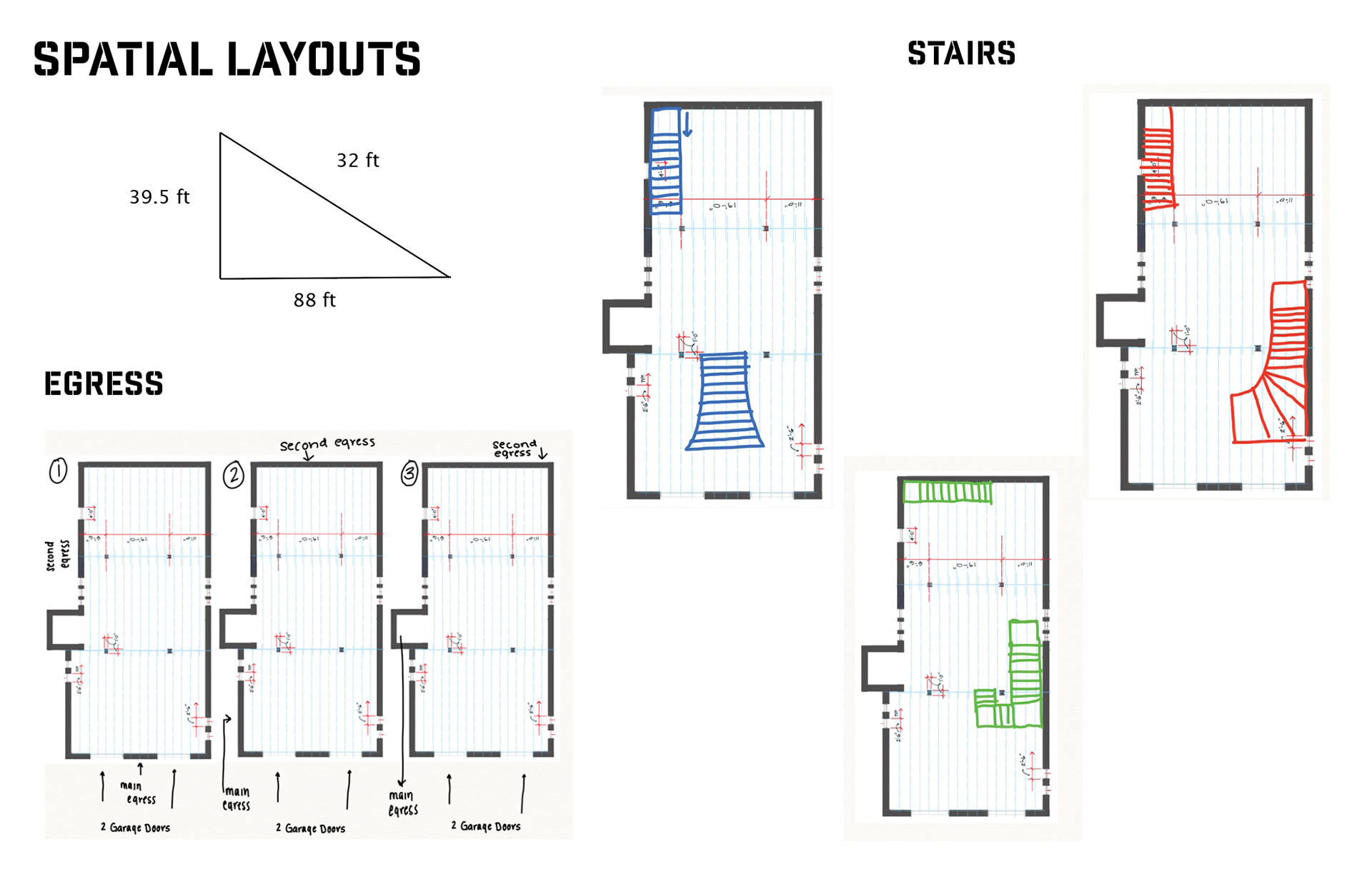
In the pages above, we as a class were learning about egress and planning where our doors needed to go in order to be in code. This helped me determine where my stair case should go, which dictated a lot about how the space would flow. I decided to go with the location of the green and red, and the space was inspired by an on-ramp on the highways.
At a time I thought about having two main staircases to create this emphasis around the center of the building, but the stairs took up too much square footage and left no space for egress. They were too close together to meet code requirements, so i decided to stick to one staircase.
Roads and pathways
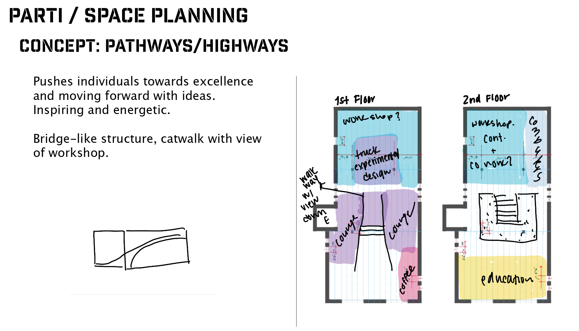
My parti diagram came from the brainstorming above, thinking about spatial concepts and symbolism throughout the space. When working with mobile businesses so centered around the road, i thought it was fitting to work off of "the high road" or the idea of "the road to success". We all take different paths in life, but starting a new business is such an exciting one that will lead to new adventures, and I wanted to capture that in my concept.
Titan trucks' tie to the space
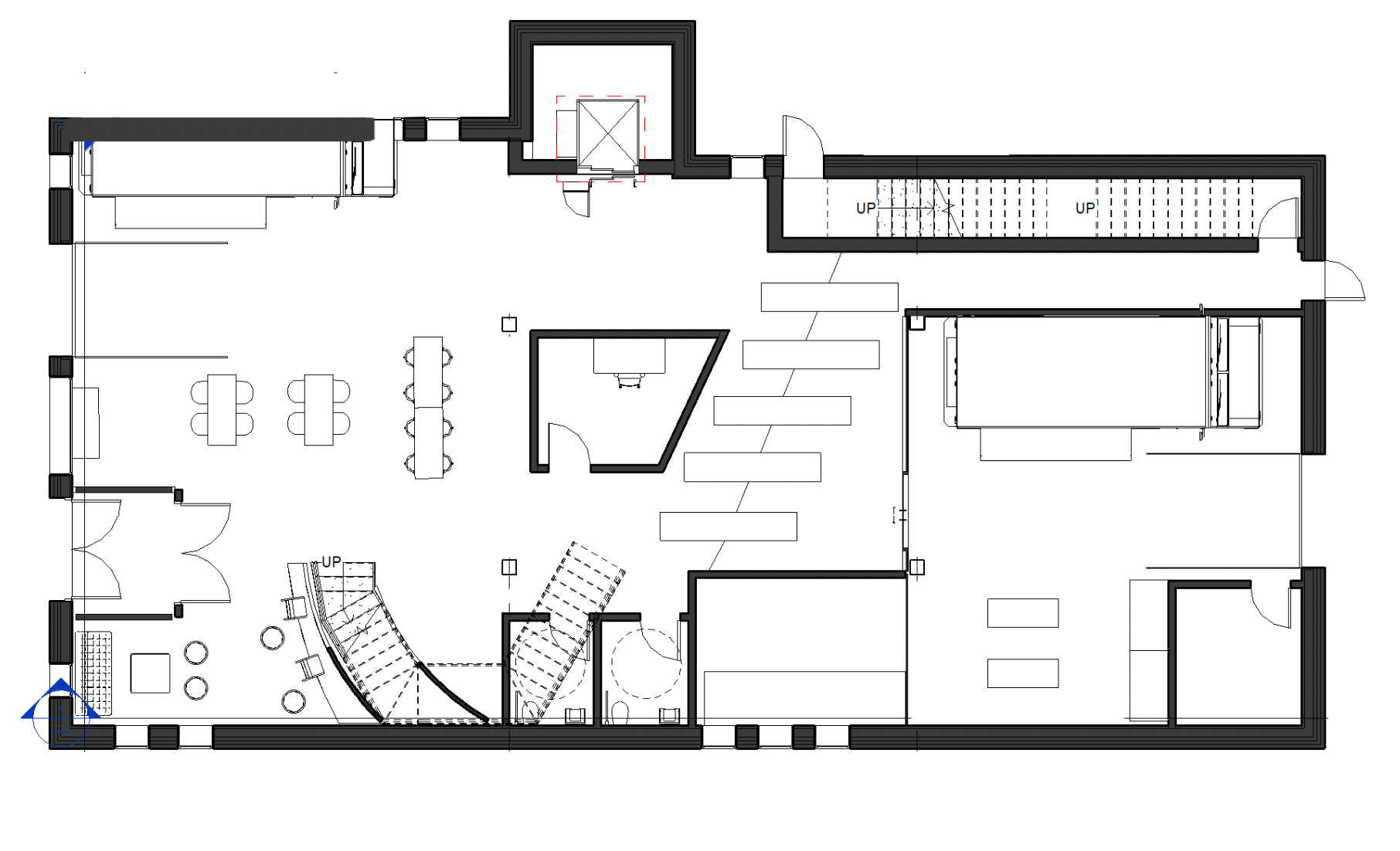
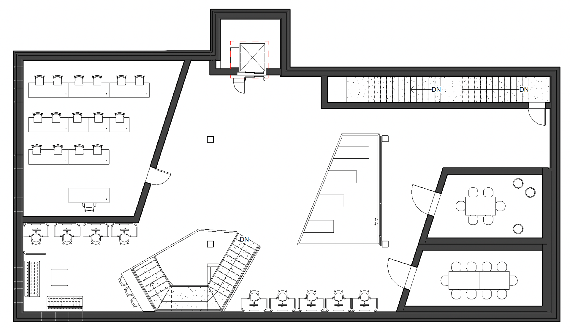
Titan trucks, our partner, is northwest of engine house 6 and I wanted to call attention to that fact to bring them into the space. To do that, we played with the physical proximity and direction, bringing this angle that ties the two together into the floorplans and the angles of the walls. While this may not be known by all those who come into the space, there is a clear repetition that will call attention to our partnership. This helped me in my space planning and helps inform my decisions.
solid and void diagraming
When building the space, we determined that using voids through the floor would not only help visually tie the two spaces together but would also emphasize the concept of roads and paths by making the floor bridge-like in a way.
I also wanted to create ways for those on the floors above to see the workshop and all that goes on in there to bring constant reminders back to the creation in the space. This is to inspire others to build stuff of their own.
This is why I chose to have a cut-out above the workshop on the second floor and to leave the space where the stairs are as an open cut between floors. This also creates this large open space towards the next floor when you enter, encouraging guests to go upstairs.
solid and void diagramming helped me to create zones in my plans to to dictate path of travel for visitors.
Plans before review 4
